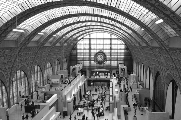
Somehow I have neglected to write about one of my favorite Paris musuems, the Musée d'Orsay. It recently reopened after over a year and a half of renovations, and I find it interesting how it has been changed. Apparently a white background is not always best for showcasing artwork, especially in the case of impressionistic or academic pieces. The radiant white can create an aura around a painting which distracts from the subtleties and nuances of the artwork. Modern artwork, usually having more abstract and larger subjects, fares better with a white background. The new Impressionist gallery in the museum has charcoal gray walls, making the pieces the center of attention, rather than the light. If you are interested, check out this video. I am looking forward to seeing the new & improved space!


I can’t say for sure, but I do believe the “new” musee d’Orsay is the one I visited. It’s my favorite museum in Paris of the ones I went to as well : )
It has been “new” for about a month now…I haven’t been in a few years, I miss it! ;)